


By George Aliferis, CAIA, who runs InvestOrama, a content platform that explores the future of investing across alternative assets, Defi and technology - but without the hype.
Data manipulation is a superpower
I’ve been visiting properties. We’ve outgrown our flat (2 young boys!). When we move it will be my biggest investment ever. And technically, it will be an alternative and illiquid asset, although I don’t see it this way.
When considering a new investment, we’ve all seen that “Past performance is not indicative of future results”, but you still want to have a look at historical data. (The UK House Price Index (HPI) is up by 10% - the worst time to buy?).
For assets like stocks or cryptocurrencies, data is straightforward. No one needs to explain how the AAPL or Bitcoin chart is created, and it will tell you a lot about the security. You can use the same data series for all sorts of ratios about risk or relative performance.
For property though, the UK HPI uses a regression model. It’s more complicated than a 2-column data series, and there are various methodologies. The UK uses hedonic regression. In the US, it’s ‘repeat-sales’. We need them because properties only trade once every few years, and some never trade.
If I were to buy an investment property, I’d still be doing lots of visits and not bothering much about the UK HPI (I think).
But what about investing in illiquid assets that you can’t visit? Investors can now access many such assets, and they are new. The returns always look promising, but a closer inspection shows the data is easily manipulated by marketers. We’ll see how, and why it matters. I’ll also share a simple framework for assessing data without going into the models.
Illiquid assets are on fire (performance-wise)
If you look at the website of all the startups offering access to “new”, illiquid asset classes, you’ll observe a common characteristic when compared to equity markets.
Wine? Outperforming
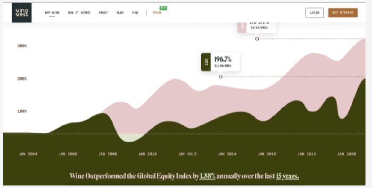
(Source: Vinovest)
Private Equity? Outperforming

(Source: Moonfare)
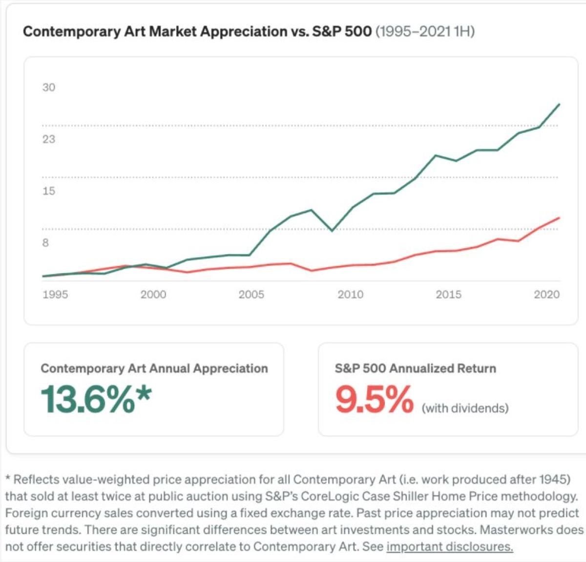
Contemporary Art? Outperforming

(Source: Masterworks)
Farmland? Not quite, but it displays many attractive features to compensate for the 1% underperformance. But where did they get12% for stocks? And why not use 9.5% (as above) instead of 12%?
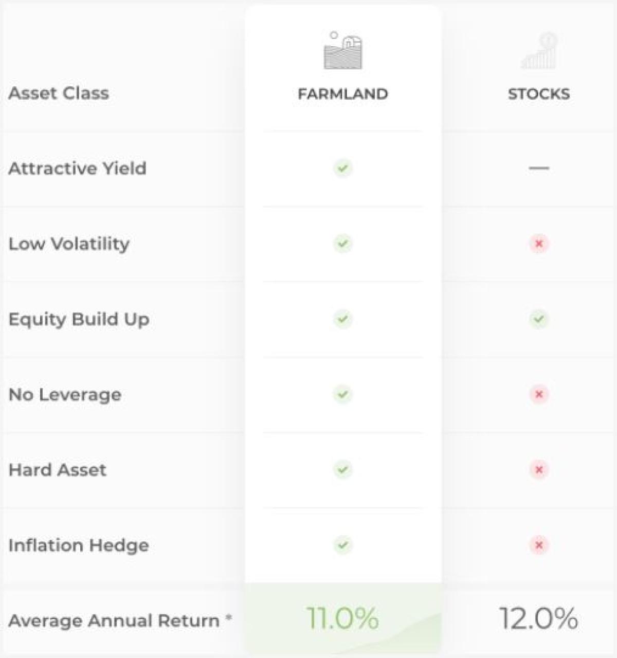
(Source: Acretrader)
The message is uniform. You’ve been missing out on this fantastic source of return, but now you can access it.
I’m just looking at the performance here. But you can almost always find a quartet: 1: decorrelation, 2: low volatility, 3: inflation hedge, 4: high performance.
So it looks like investing in equities is kinda silly when we now have access to “better” asset classes. But not so fast:
Data = Marketing
Marketers manipulate data.
It may sound like an accusation, but it’s just acknowledging a skill.
Manipulate = to handle or control (a tool, mechanism, information, etc.) in a skilful manner.
I should know. I used to market investment products to institutional investors for years. They were professionals, so they were supposed to make informed decisions after reading the disclaimers, doing their own research, etc., but backtesting was always a critical indicator of the product's commercial success.
It sounds like black magic, but backtesting or adjusting a strategy using historical data is quite simple: change the period, the benchmark, and the way the information is presented. If the model is not a linear data series, then you have even more ways to manipulate it.
And if you can’t get a good enough backtest - adjust the product before launch.
Data is part of the narrative we use to make an investment decision. For liquid, investable asset classes, you don’t need to think about where it comes from. It’s standardized, and exchanges provide official data. But for illiquid assets in uncharted territories, the data serves more scrutiny.
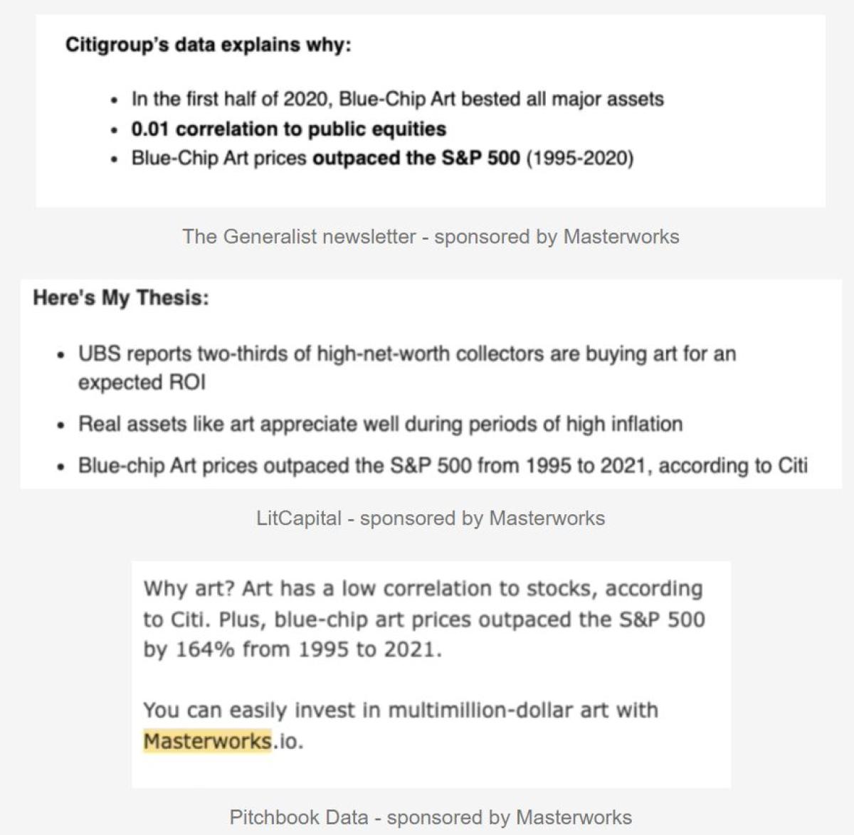
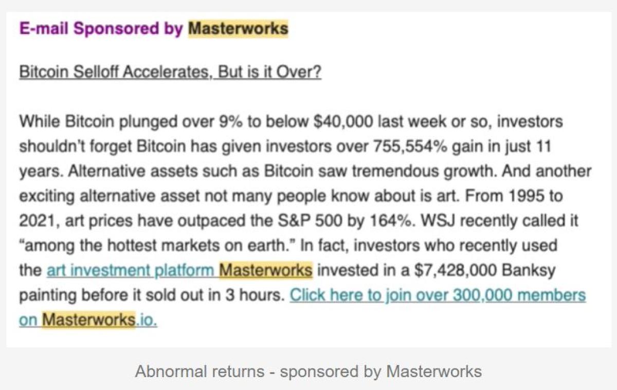
All of the companies above present indices for their asset class, without providing a comprehensive explanation. Masterworks do better than average, so we will use them to look closely.
A closer look at the Masterworks data
Masterworks offers an explanation with*. Let’s dig into it.
Masterworks controls the data and the underlying
Going through the small print, you can find that the chart for “Contemporary Art” is based on an index created by Masterworks, including a selected group of around 40 “Blue Chip” contemporary artists.
This index is not investable. As per the footnote, Masterworks does not offer securities that directly correlate to Contemporary Art.
-
The data comes from Masterworks
-
The index is defined as “Contemporary Art” and “Blue Chip” which are specific to Masterworks.
The methodology
At least it’s based on public data from auction houses. They use the Repeat Sales methodology (a regression model): using pieces that sell at least twice. It is common in the art world, but it has a drawback: selection bias.
Auction houses have a reserve price. If it’s not reached, the piece won’t sell. Therefore, it will not appear in the data. In other words, the data only includes the items that perform the best.
-
Academics have addressed the selection bias (removing it reduces the performance by 3.5% p.a.)
-
A review of literature exhibits much lower returns for art investing (0 to 5% p.a. in real terms)
-
Art professionals advise not to expect financial returns from paintings
The liquidity question
The benchmark is the S&P 500 (also not investable, but you can track it with an ETF that charges 0.03% fees) that trades continuously during US market hours. So how can we compare it with paintings that trade once every few years?
To make it simpler, let’s assume there’s only one stock (AAPL in blue) and one painting (red line) that traded twice in a year, and they have the same return.
The volatility of the red line is 0, and its correlation with the market must be very low. So on the paper, the stats of the red line will look great. But in practice, assuming we can predict both returns, the stock is always better because you can sell it anytime in case of emergency. In contrast, the red line has only two liquidity events at the start and finish. And in reality, the second liquidity event is unknown.
The lack of liquidity can falsely boost the characteristics of an investment.

But there could be something even juicier.
The data is moving
Do you sometimes spend so much time researching alts that your vision gets blurry? That’s what I thought was happening to me.
The performance chart from the homepage of Masterworks (see above) looks different from the one listed in this article (see below).
It’s hard to see clearly. But as the S&P 500 went from 1 to 3+ between 1999 and 2019, I estimated the art index for the same period:
-
approx. 3 to 23 on the left (1 to 7.6)
-
1 to 5.3 on the right

This is not a tiny difference. $1,000 “invested” on the chart on the left returned $2,300 more than the chart on the right.
From the small print, it looks like the methodology has changed, but how can I be sure? Do I need to have my eyes checked?
Thankfully, there’s another reference using the Masterworks data, and it’s a solid one: Citigroup. They publish an annual Global Art Report. They look at the correlation, volatility, and more, but I’m just going to look at the long-term performance of contemporary art.
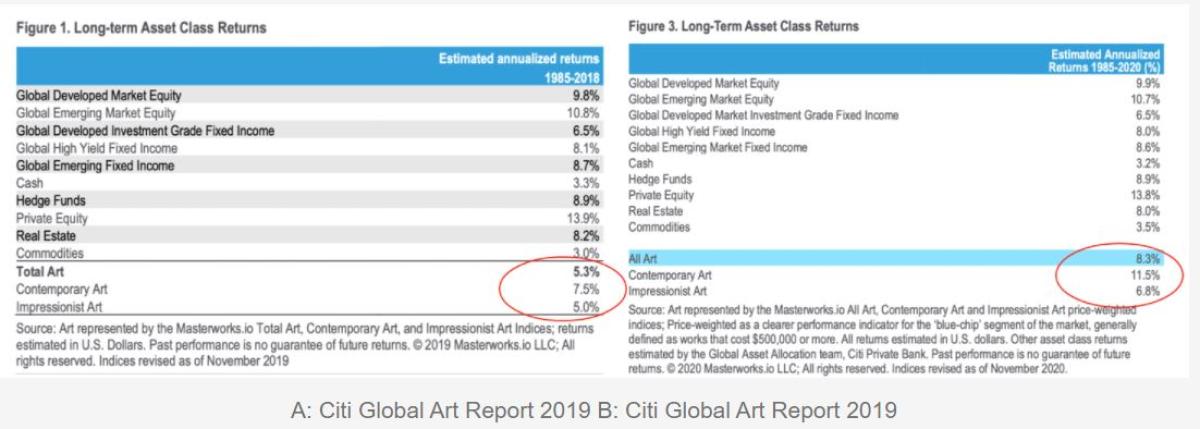
2019 report (left - A) shows 7.5%: meh!
2020 report (right - B) shows:11.5%: better than everything else, except Private Equity.
The years 2019 & 2020 were not great for art investing. They do not explain the change in annual performance (+4%). What has changed is the methodology. But the index is used as a benchmark in the same way.
Phew, my eyes are fine. The index is moving!
We see the marketing skills in action. The data is being manipulated to improve the backtest. It shouldn’t matter though. We know it’s just a calculation by marketers, not an investable asset class. And yes, past performance is not an indicator of future results.
In reality, what’s the impact on the allocator who’s diligently researching alts to diversify into new asset classes?
-
Reading A: ‘I’m fine.’
-
Reading B: ‘Over the last 35 years, I’ve been missing out on an asset class that delivered +1.6% p.a compared to equities, or 180%🤯 in total!’
What does that mean for illiquid assets?
Remember, I picked the Masterworks data because there was MORE information. So, if you want to read how the Private Equity asset class can ‘fool’ investors with its choice of benchmarks, its calculation of performance, correlation, etc., here is an in-depth, data-driven analysis.
All data is not created equal. The charts above compare an investable time series (the equity index) with a complicated regression that can’t be invested. It’s like comparing apples to oranges.
Here is a simple framework for assessing data (particularly for illiquid assets).
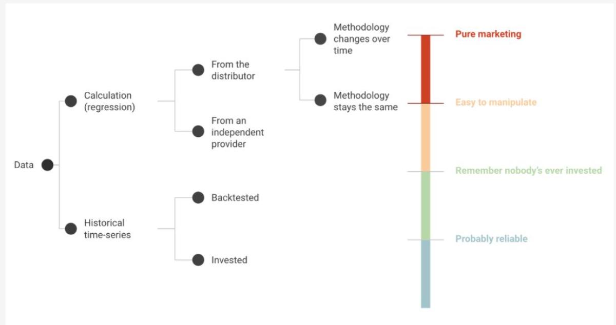
The Masterworks data would sit at the very top: a calculation, from a distributor, that changes over time: pure marketing and highly unreliable.
That doesn’t mean that paintings, private equity or other illiquid assets can’t outperform.
But your investment process should include a critical look at the data, even when it comes from your favourite investment newsletters or influencers.
Here is my personal collection from January 2022:
And that highlights the issue. Once you’ve established your calculation as “The Index” for the asset class, you can get everyone to reference it, and they don’t even need disclaimers!
There’s a similarity between YouTubing and investing. You can 1) move fast and risk breaking things, or 2) go slow and safe.
When I post short videos, I like to move fast. It’s ok if they’re not perfect. That was also my approach to crypto. Investing in small amounts is a great way to learn and you can get in and out anytime. That worked for me - until I truly understood the impact of gas fees!
When I post longer videos, I like to double and triple check. And If you’re looking to invest in an asset class where the minimum amounts are significant, and with long holding periods, then slow and safe is the only option.
However, last week after spending endless hours on a video about investing in fine art I posted it with a glitch in the edit🤦🏻♂️. It’s been removed, but instead of re-posting, I decided to reflect on the slow and safe approach to new asset classes.
Original Article: Why Are All Illiquid Alts Outperforming? (substack.com)
About the Author:
George Aliferis, CAIA is the CEO of Orama a video and audio marketing agency specializing in fintech and the content creator behind InvestOrama, a content platform that explores the future of investing across alternative assets, Defi and technology - but without the hype. Previously, George worked as a front office professional for over a decade across derivatives, ETFs and alternative investment products in Paris, Singapore and London. He holds a Masters Degree from HEC Paris.
