 Interest rates have been declining for more than thirty years now, and seem to some to be as low as they can get. The federal funds rate and short-term money market rates have been close to zero since the crisis of 2008. It may be that we are seeing a change to this, not just at the margins but in a way that will be sharp and sustained.
We’ve been pushing the limbo bar down, discovering how low we can go, and now the usual combination of market and policy forces may be ready to raise it up again.
Welton Investment Corporation, a northern California based CTA, has prepared a white paper on the likely investment consequences of a period of rising rates.
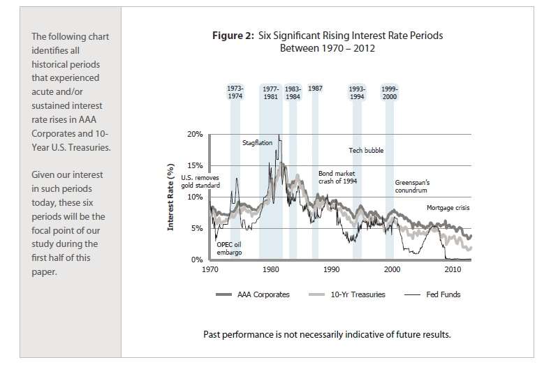
They analyzed periods of sharp and/or sustained rate increases since 1970. It turns out there have been six such periods, as the graph below indicates.

The earliest of these periods was that of the Nixon-era oil shock. The Federal Funds rate rose from 4.48% in mid-1972, to 13.55% two years later.
The Obvious and the Contentious
The first point the white paper notes about the consequences of such an increase is the most obvious: as rates go up, the value of bonds falls.
The second point is a subject of some contention. As the value of bonds falls, there can be a return-seeking move into equities, and many investors are even now trying to get ahead of that curve. But, Welton notes, “historic equity market returns during acute interest rate rise periods are mixed … generally flat.” After all, the period just described, the period of that huge federal funds rate run-up overseen by Fed chairman Arthur Burns, equities did terribly.
Taking all six analyzed periods together, the S&P 500 produced an annualized return of just 0.2%. The MSCI World Index did better, but was still unimpressive, with an annualized return of 2.3%.
Welton acknowledges that there can be “countless arguments and explanations supporting either case,” that is, supporting either a bullish or a bearish view of interest rate increases as a signal for the equity markets. The bottom line, though, is that “rate changes alone reflect just one ingredient in the overall investment puzzle.”
The best investment approach during a period of sharp and sustained interest rate increases (roll of drums please) is: a trend following strategy involving several asset classes. In preparing this report, Welton modeled such a strategy employing equity indexes, fixed income, commodities, and currencies, “with risk evenly allocated across all of the four major market sectors.”
The strategy produced generally positive performance from three of the four sectors (equity indexes are the exception). The commodity sector was the most reliable performer. Intuitively, this is what one would expect. Investment in commodities puts one on the seller’s side of the price inflation that marks such periods. Still, Welton (which – have I mentioned this yet? – is a CTA itself) professes to be surprised by the consistency of the performance of the commodity sector across all the periods studied.
As you can see from the chart above, two of the six periods under study occurred within the Clinton years, which “were perhaps less obviously characterized by their overall inflationary conditions” than were earlier periods, yet in these periods, too, a commodities based trend-following strategy did quite well.
Escaping the Glob
With regard to fixed income: the obvious play is to short such instruments as a trend-following play during a period of rising interest rates. The white paper’s results confirm that suggestion, shorting fixed income “can deliver meaningful returns.”
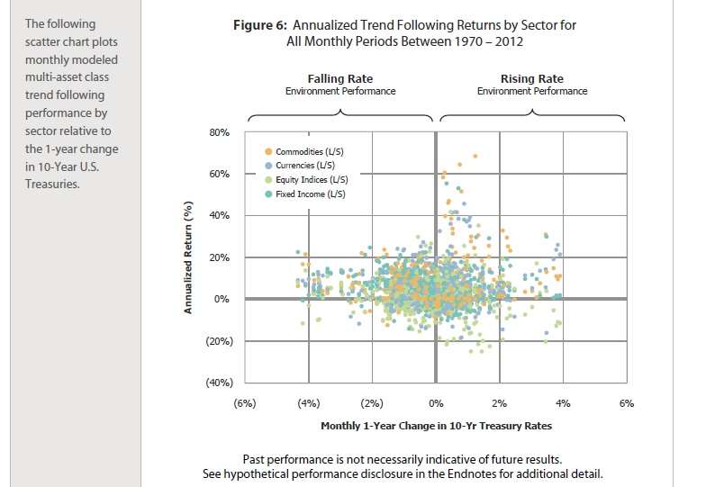
But looking again at Welton’s multi-asset model as a whole: As the scatter chart below indicates, the aggregate return is about even for falling-rate and rising-rate environments. If returns month by month are charted against each month’s change in Treasury rates, then the mass of the consequent data points adhere together in a green/gray glob, and the glob has a center of gravity at zero rate change, and at a positive rate of return.

But you can also see that on the right-hand side of the graph, under “rising rate environment performance,” there is a somewhat wider dispersion. There are more results, in short, those escape the gravitic pull of that central glob and mount upward.


