


By Brian Chingono, Partner, Director of Quantitative Research & Europe Portfolio Manager at Verdad.
Is the Sharpe Ratio as sharp as it’s made out to be?
We all love positive surprises. It would be wonderful to receive a Ferrari on your birthday, when all you were expecting was dinner at your favorite restaurant. And it’s fair to say that we all hate negative surprises. It would be awful to find out that the surprise Ferrari isn’t a free gift and was instead charged to your credit card.
For most people, the change in well-being brought on by these two surprises is not the same. The pain of having to foot an unexpected large bill far exceeds the joy of being gifted a similar amount.
So why do common measures of risk in finance, such as standard deviation, treat positive surprises in the same way as negative surprises?
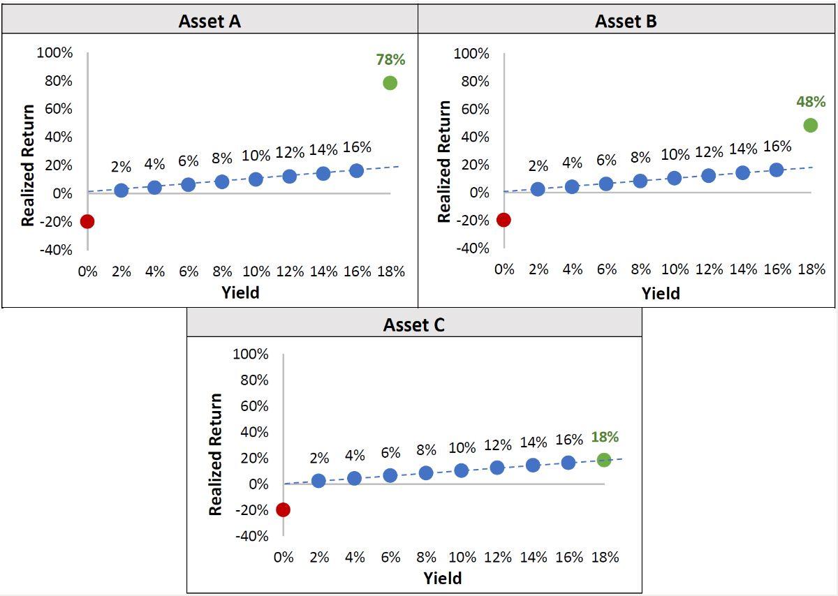
Imagine you’re meeting with your financial advisor, and she offers three assets that you could put into your retirement portfolio. Each asset has a long history of pricing information, as reflected by its yield, coupled with a long history of realized returns. Therefore, your advisor combines this information in the charts below to show the historical relationship between expected returns (i.e., yields at purchase) and subsequent realized returns for each asset.
Assuming yields today are the same across the three assets, which one would you overweight in your portfolio?
Figure 1: Realized vs. Expected Returns of Hypothetical Investment Options
Source: Verdad research. For illustrative purposes only.
In the charts above, surprises are measured in terms of distance from the dashed line. So in all three assets, the -20% return at zero yield indicates a -20% surprise. In Asset A, the 78% return at an 18% yield reflects a +60% surprise. And in Asset B, the 48% return at 18% yield indicates a +30% surprise.
The only difference between the three assets is what happens when yields are very high (i.e., the assets are extremely cheap). In those scenarios, Asset A tends to deliver enormous positive surprises, Asset B generally delivers moderate positive surprises, and Asset C delivers no positive surprises—its subsequent realized return matches its yield at purchase.
Otherwise, the three assets have an identical relationship between going-in yields and subsequent returns. When the assets are most expensive (0% yield), they tend to deliver the same negative surprise. And when yields are in the 2–16% range, returns match the yield.
The obvious choice would be to overweight Asset A in your portfolio. It offers the highest upside when it is cheap, and its downside is the same as the other assets.
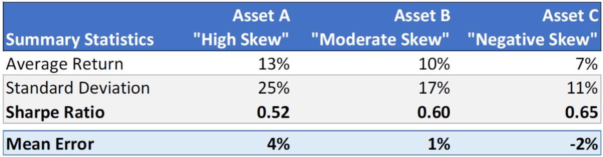
But what happens when we compare the assets in terms of volatility and Sharpe Ratio? As shown in the table below, Asset A has the highest average return, but it also has the highest standard deviation, resulting in the lowest Sharpe Ratio. Even though the other alternatives—Asset B and Asset C—have lower average returns, their lower volatility results in higher Sharpe Ratios. So if you were making investment decisions based on the Sharpe Ratio, or the “risk-adjusted return,” as it’s often sold, you might be pushed into overweighting Asset C.
But that can’t be right! As we saw in the charts above, Asset C only delivers negative surprises. It doesn’t offer positive surprises to make up for the occasional disappointments.
Figure 2: Comparison of Hypothetical Investment Options
Source: Verdad research. For illustrative purposes only.
So, what is going on here? Why does the Sharpe Ratio push us towards an academic objective of maximizing “risk-adjusted returns” (which we cannot eat) instead of supporting our simple, real-world objective of maximizing returns (which we can eat)?
The problem lies with using standard deviation as a measure of risk. In his new book, Statistical Consequences of Fat Tails, Nassim Taleb argues that “we should retire standard deviation, now!” because it has “confused hordes of scientists” and probably “does more harm than good.” Because standard deviation squares the surprises, it treats negative and positive surprises in exactly the same way. So, a 30% return when you were expecting 10% (a +20% surprise) is treated the same as a -10% return when you were expecting 10% (a -20% surprise). The squaring means that both surprises are treated as a 0.04 deviation. Worse, squaring the surprises means that big positive surprises look much more scary than moderate negative surprises. For example, (+40%)2 is four times larger than (-20%)2. When measured in terms of standard deviation, an asset with big positive surprises, like Asset A, can look riskier than something like Asset C, which only offers moderate negative surprises.
The Sharpe Ratio is calculated by dividing the average return by the standard deviation. Since the standard deviation is much smaller for Asset C, it ends up with the highest Sharpe Ratio, even though it has a mediocre average return.
A more informative measure would be the mean error, as shown in the last row of the table above. The mean error is calculated by simply averaging the surprises. For example, looking at the charts in Figure 1, the mean error for Asset A would be calculated by averaging the -20% surprise with the eight 0% surprises, as well as the +60% surprise. This results in a +4% mean error for Asset A, which indicates that this asset tends to offer positive surprises, on average.
Applying the same analysis to Asset B results in a 1% mean error, which indicates that this asset also tends to offer positive surprises, but they are more moderate in magnitude. And Asset C has a mean error of -2%, indicating that it tends to offer negative surprises.
The mean error aligns with our goal of maximizing returns. Asset A, which has the highest average return of 13% per year, also has the most positive mean error, reflecting its big positive surprises. Therefore, Asset A would indeed be the correct thing to overweight in your portfolio to maximize returns.
Part One of the Sharpe Week series is here: Sharpe Week: The Sharpe Ratio Broke Investors’ Brains | Portfolio for the Future | CAIA
Great Video Discussion on Sharpe: Talkin' Shop: Sharpe Ratios (standpointfunds.com)
About the Author:
Before joining Verdad, Brian Chingono worked at Dimensional Fund Advisors and Credit Suisse. Brian earned an AB from Harvard College and an MBA with honors from the University of Chicago Booth School of Business.

As a graduate student, Brian co-authored two research papers related to Verdad’s investment strategy: Leveraged Small Value Equities and Forecasting Debt Paydown Among Leveraged Equities.
Original Article: The Blunt Ratio — Verdad (verdadcap.com)